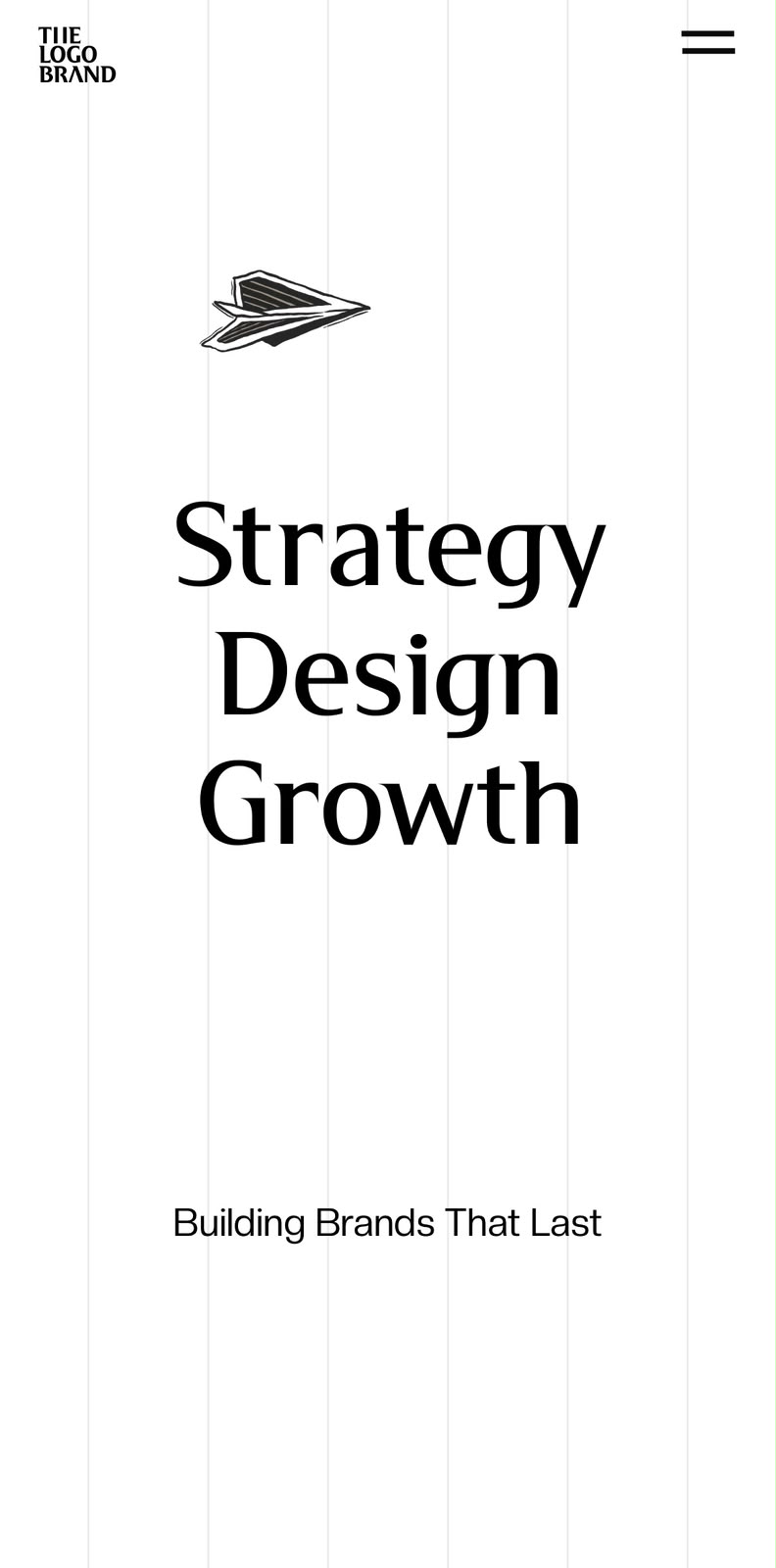
Building an expressive agency website without compromising usability.
The site needed to feel as expressive as the work the studio creates — while still being easy to navigate, responsive, and practical to use. I worked primarily as the developer, while also contributing to visual design, UX structure, interactions and animations.
Framer Development · Interaction Design · Visual Design · UX
The Logo Brand is a creative agency working across brand strategy, design and growth. The website needed to communicate that breadth while feeling like a distinctive brand experience.
The challenge wasn't simply to make another agency portfolio. It was to create a website that could carry a strong visual personality without letting the visuals get in the way of the experience.
How expressive can an agency website be while remaining easy to use?
01 / Visual direction
Big type, repetition, movement — with structure underneath.
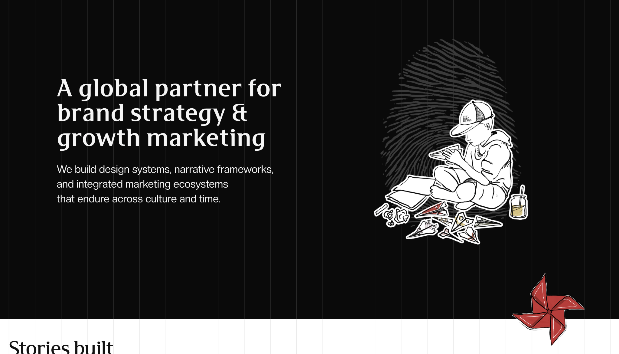
The design direction leaned heavily into large typography, repetition, movement, strong visual statements and project-led storytelling. Those elements give the site its personality, but each one still has to help the user understand where they are and where they can go.
02 / Homepage
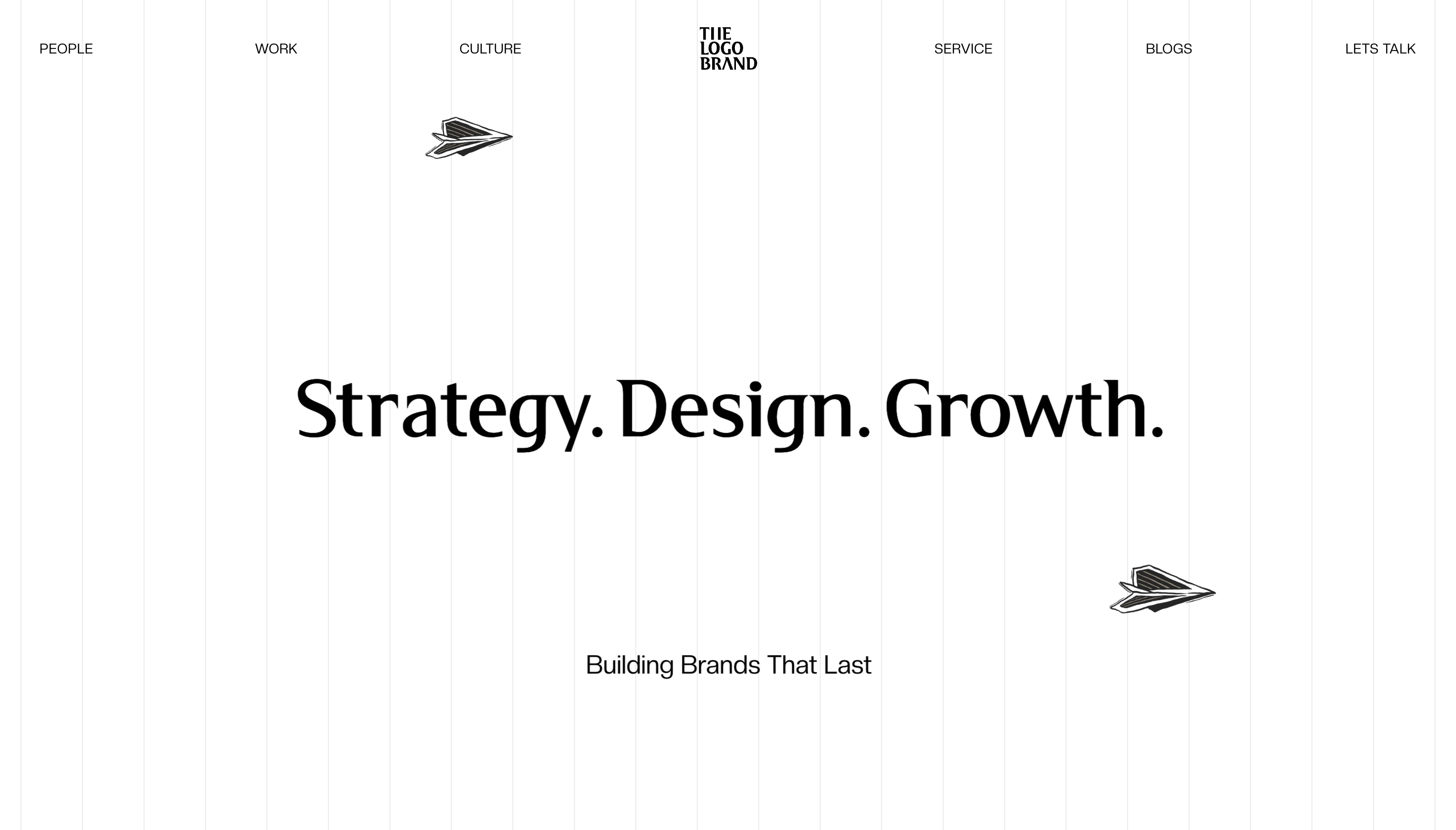
The first screen sets the tone.
The opening experience introduces the agency through a simple idea, expressive typography and illustration rather than a conventional service statement.
Visual language · hierarchy · brand expression
03 / Work
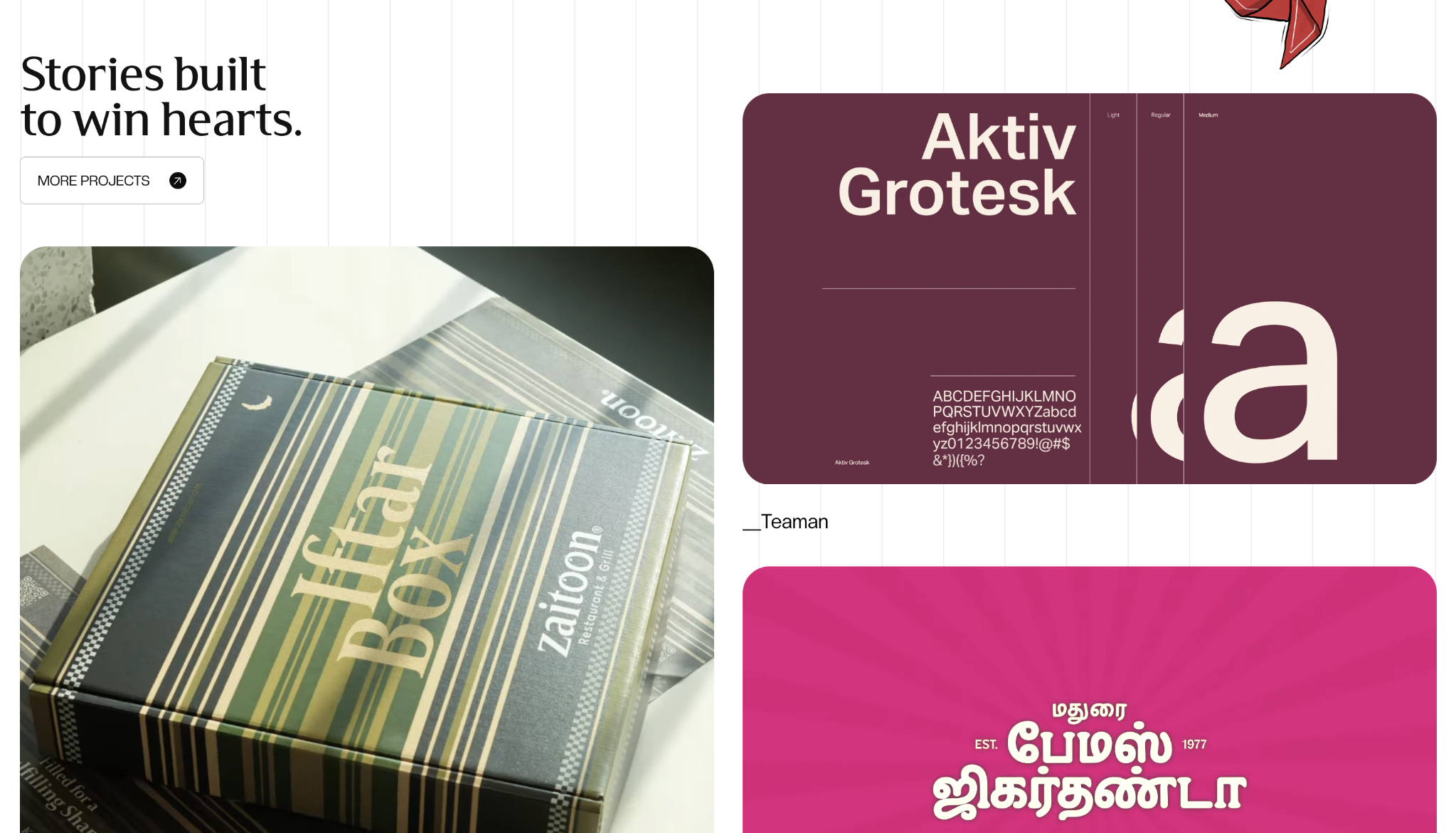
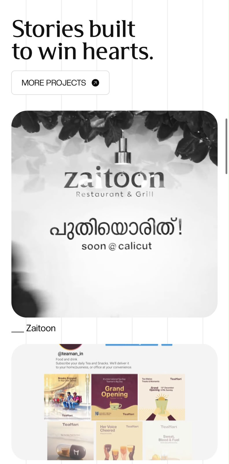
The work gets to feel like the work.
Instead of reducing projects to uniform thumbnails, the system gives different pieces room to retain their own visual character while keeping them recognizable and browsable.
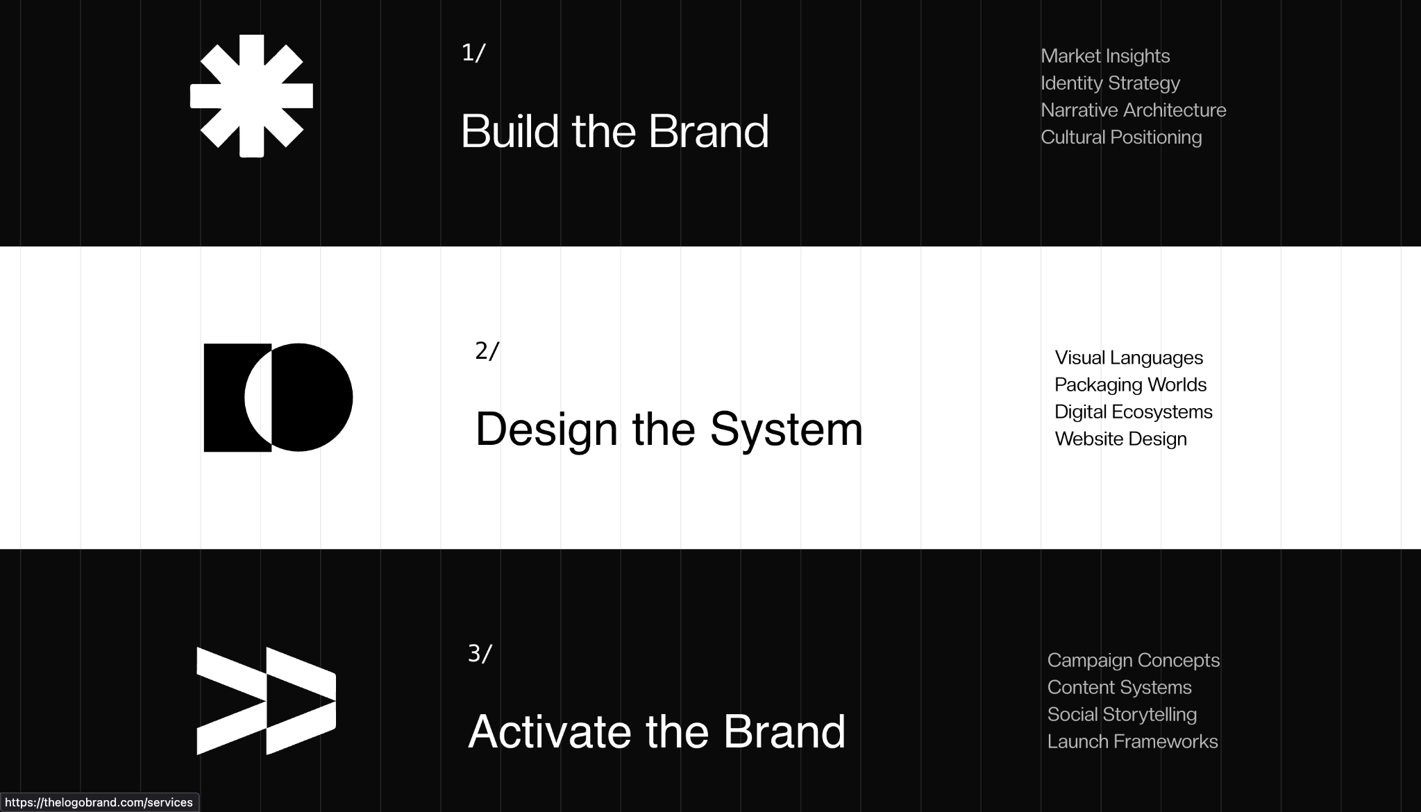
The service structure uses alternating visual states to turn a list of capabilities into something that feels like part of the brand experience.
Information architecture · interaction · rhythm
05 / Brand values
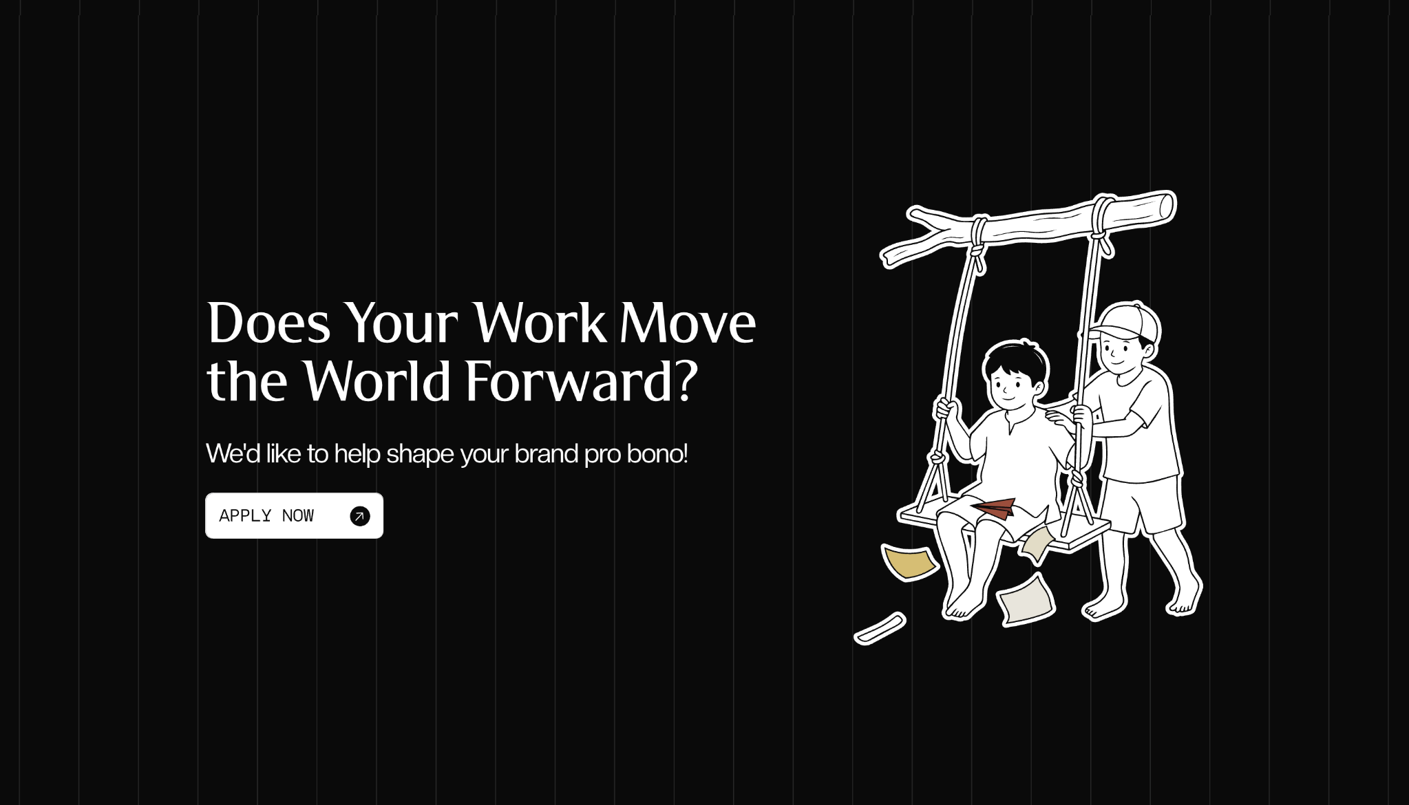
Brand values shouldn't live in a footer.
The pro-bono section turns the agency's values into an actual part of the experience, giving the message room to breathe without breaking the visual language.
Narrative · purpose · call to action
06 / Content system
The work isn't only client work.
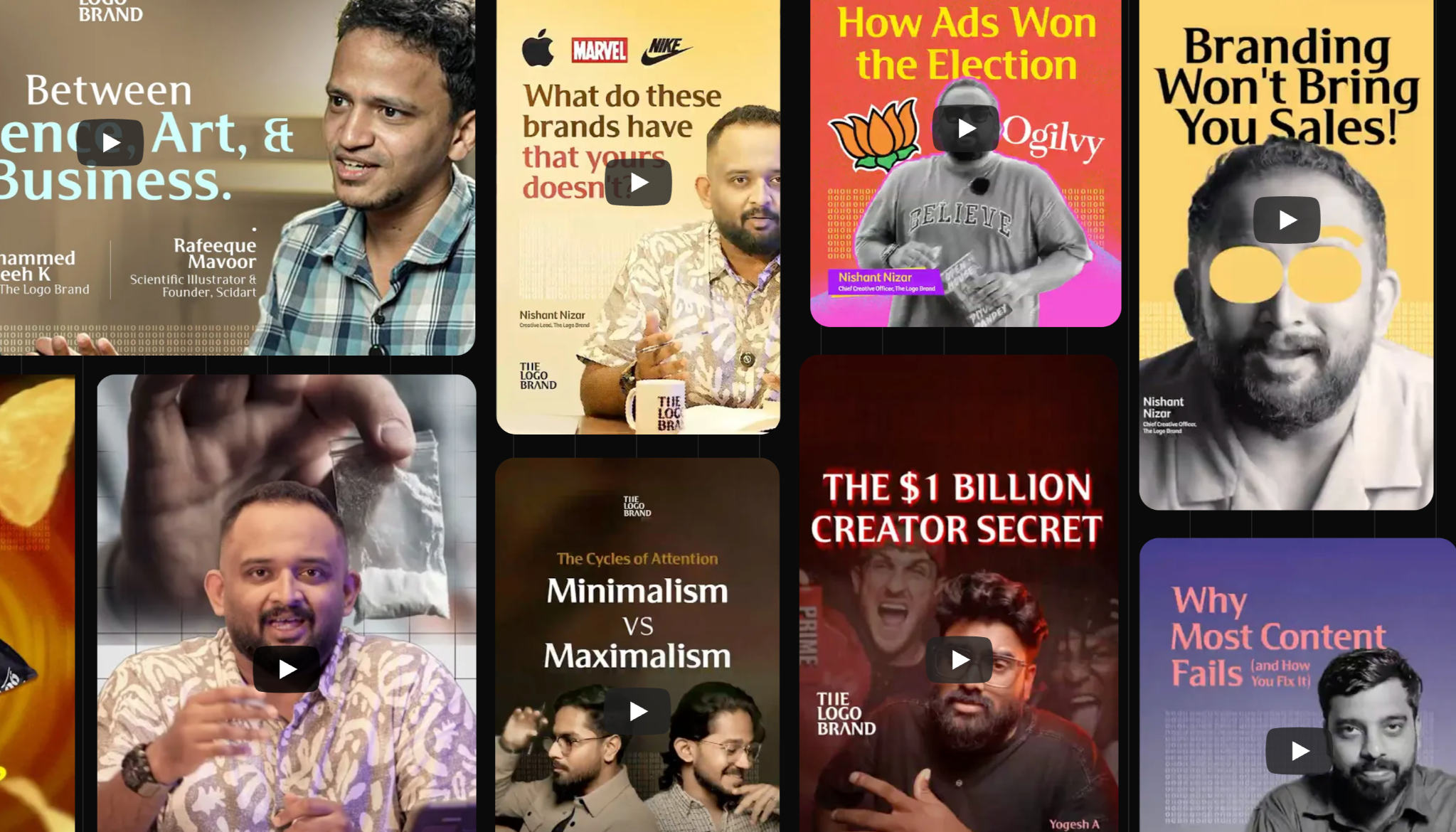
The website also carries the studio's own thinking, interviews and cultural point of view. That makes content another expression of the brand rather than an isolated blog section.
07 / Content
Content becomes a visual system too.
Video, editorial posts and social storytelling sit inside the same visual world, giving the studio a way to keep communicating between major project launches.
Content design · editorial rhythm · culture
08 / Editorial
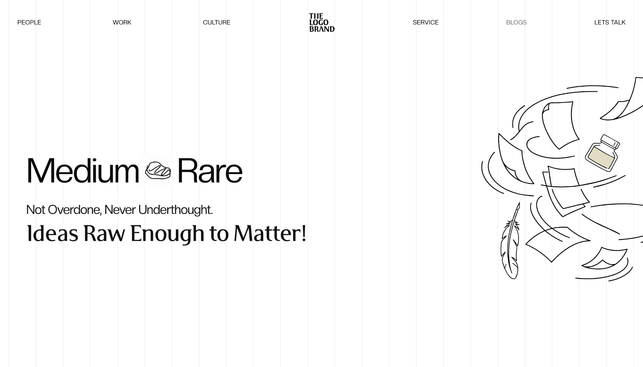
Ideas need room to breathe.
Pages such as Medium Rare shift the tone without abandoning the underlying grid, typography and navigation system.
Editorial design · consistency · variation
09 / Blog
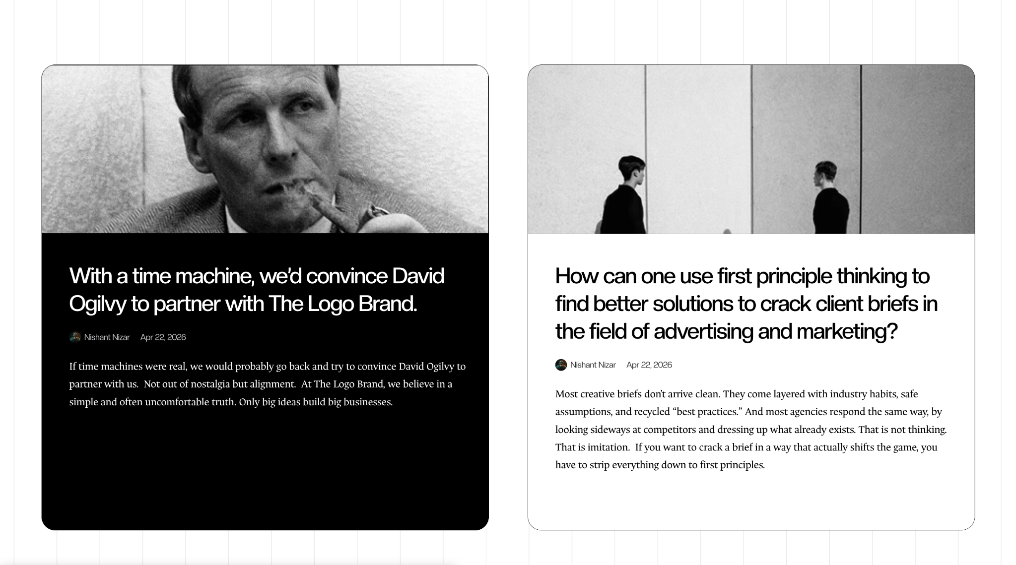
Long-form content still belongs to the system.
Article cards and editorial layouts keep the content legible while preserving the same expressive relationship between typography, image and space.
Reading · hierarchy · editorial layout
10 / Building it
Design / build / test / adjust.
The design couldn't simply be handed off as static screens. It had to become a working system in Framer: reusable components, responsive layouts, interactive states, animations and a production website.
01Visual / UI Designlanguage + interface
02UX / Page Structurecontent + navigation
03Framer Developmentcomponents + responsive
04Interactions / Animationmotion + behaviour
11 / Responsive design
Mobile isn't a smaller desktop.
A highly art-directed desktop experience can fall apart quickly on mobile. Large type becomes oversized, interactions become awkward and navigation needs to simplify.
The goal was to preserve the same brand character in a different context: clearer hierarchy, simplified interaction and the same expressive visual language.