Editorial type
Large serif moments create character and give the studio a recognisable voice.
Fern Studio · 2026
A self-initiated project that began as a fictional creative studio and grew into a complete brand, website and reusable Framer template.
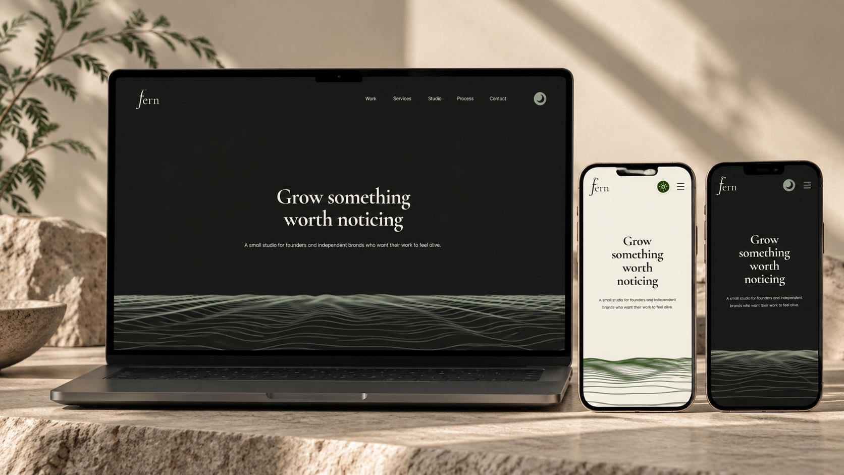
There was no client, existing identity or content system to inherit. Fern was built from a blank canvas as a way to explore what a small, design-led studio could look and feel like when every part of its digital presence is considered.
The project moved beyond a landing page: identity, voice, pages, components, interactions and responsive behaviour were designed as one connected system.
Fern's visual language balances a restrained palette with expressive typography and a soft organic thread. The result is intended to feel considered without becoming precious.
Large serif moments create character and give the studio a recognisable voice.
Light and dark themes create rhythm without relying on loud colour or decoration.
The flowing line system acts as a visual thread through the experience.
The site was structured around the core questions a prospective client has: What does Fern make? What does the work look like? How does the studio work? How do I start a conversation?
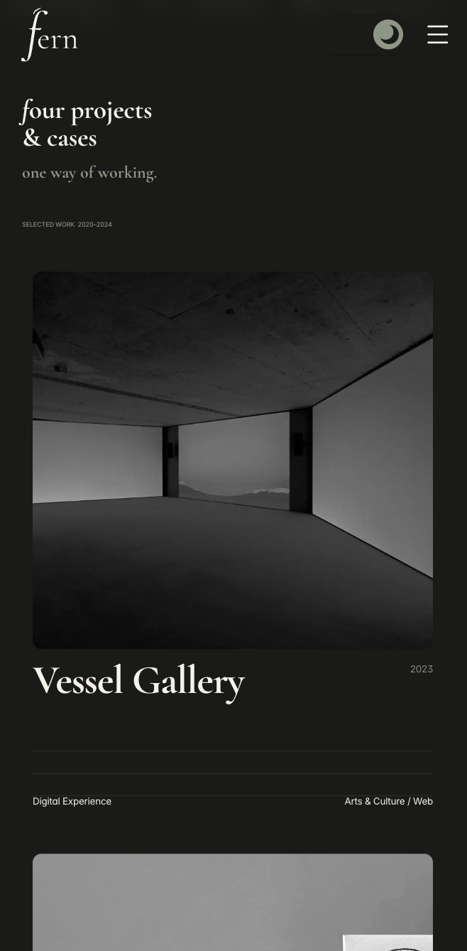
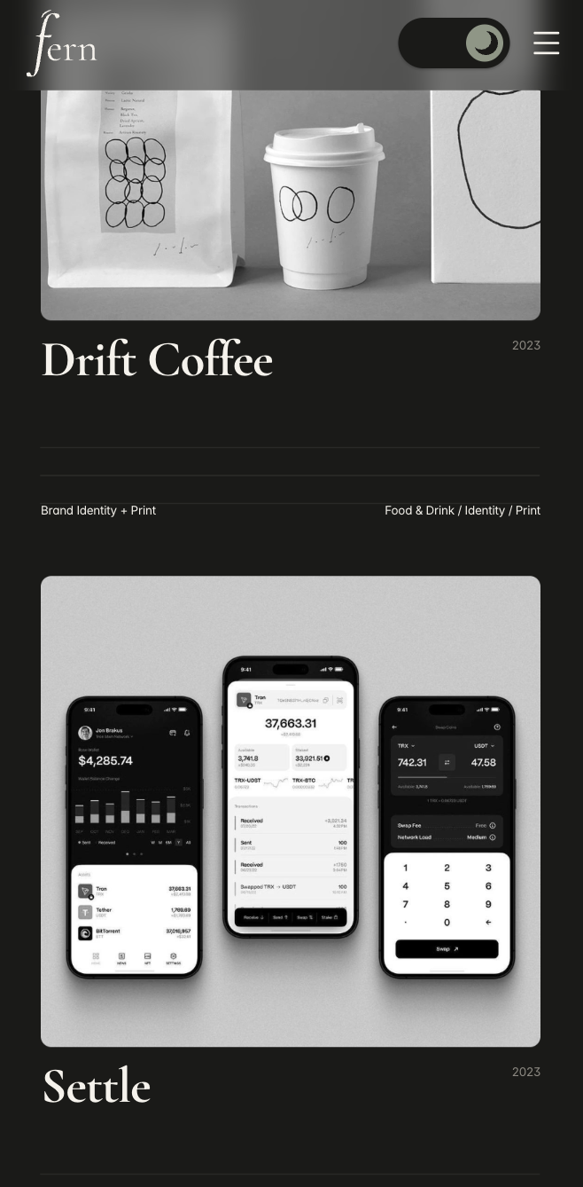
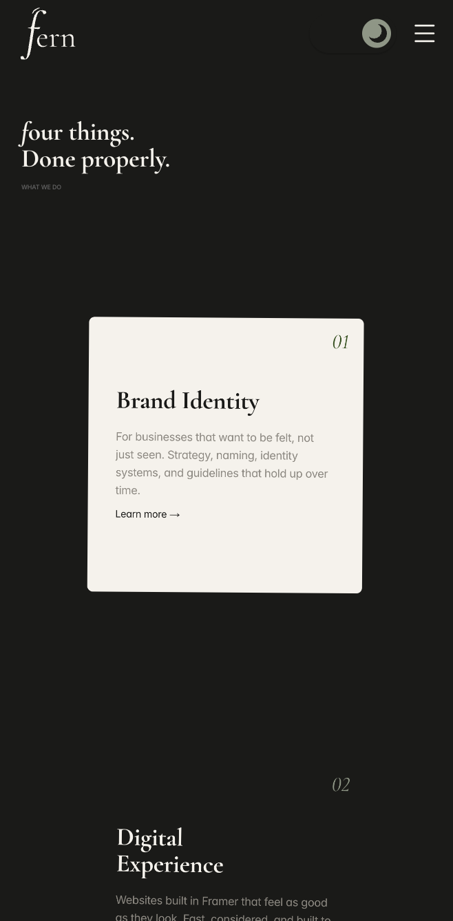
The same visual language carries across viewport sizes, while navigation, type scale, spacing and content density adapt for smaller screens.
Large editorial compositions establish the studio on desktop. On mobile, the hierarchy becomes more vertical and focused, with the same typography, palette and line language holding everything together.
The project became more useful once the visual decisions were translated into repeatable rules and components.
Display serif for voice, neutral sans for utility and compact labels for structure.
Consistent margins, flexible grids and deliberate whitespace keep the pages calm.
Navigation, project cards, service blocks, buttons and content patterns are reusable.
Hover, transition, scroll and navigation states add feedback without overwhelming the content.
Turning Fern into a template changed the goal. The system had to remain recognisable while giving another person enough flexibility to replace the content, imagery and project mix without breaking the design.
The work was designed and developed together, so components were tested in the actual environment instead of being treated as a handoff at the end.
With a fictional project, there is no client saying when enough is enough. The useful constraint became knowing when another page, animation or component was no longer improving the experience.
Does this make Fern better, or am I just making it more complicated?
A fictional project still needs constraints. Defining who Fern was made later decisions easier.
A design system is more than components. Tone, spacing, typography, imagery and behaviour all belong to the system.
Designing for reuse changes the decisions. A template has to separate what makes a design recognisable from what needs to stay flexible.
Design and development work better together when ideas can be tested immediately in the real interface.