Designing e-commerce experiences around what users actually do.
At Conversion AB, I worked on e-commerce redesigns where design decisions were tied to a practical question: what is stopping someone from completing a purchase? Across different brands and funnels, the work involved product pages, navigation, homepages and checkout experiences, using UX audits, analytics, session recordings and experimentation to identify and reduce friction.
Product Design · UX · CRO · E-commerce
01 / The Face Shop UAEProduct page · mobile02 / SuperpandaDiscovery · cart03 / WaterScienceTrust · product
Context / 01
Conversion problems rarely come from one obviously broken screen.
Sometimes it is a product page that is too difficult to scan. Sometimes category structure makes discovery harder. Sometimes checkout asks for too much, or a product does not establish enough trust.
Instead of redesigning everything by instinct, the work started with the behaviour behind the interface.
What is stopping someone from completing the purchase?
02 / The CRO loop
From friction to hypothesis.
The process connected interface decisions to observable behaviour: identify friction, define what should change, design the intervention, then validate it.
01
Audit & Insights
UX reviews, funnel analytics and session recordings revealed friction points and opportunities.
observe
02
Hypothesis Building
Observations became measurable hypotheses, success metrics and instrumentation.
define
03
Redesign
Wireframes and high-fidelity UI focused on hierarchy, clarity and persuasion.
design
04
Test & Iterate
A/B experiments and analytics were used to validate and scale solutions.
learn
03 / Client redesigns
Six problems. Six different solutions.
Each engagement started with a different point of friction, so the interface response changed with the problem rather than forcing every brand into one conversion pattern.
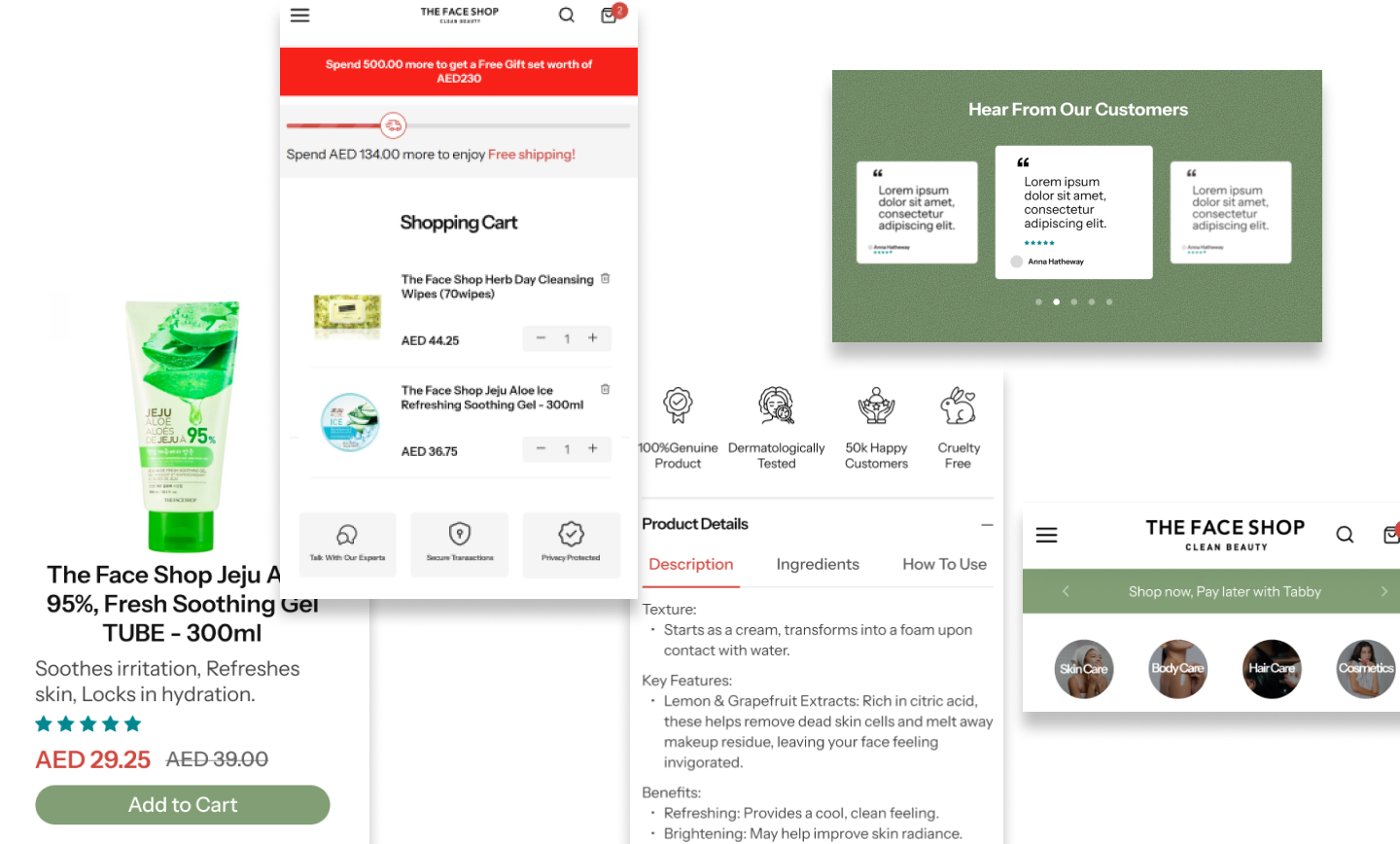
01 / The Face Shop UAE
Reducing cognitive load on product pages.
Challenge: Product detail pages were cluttered, making it harder to understand the product and take action.
Approach: Reworked product hierarchy, simplified the mobile-first layout and introduced clearer, high-contrast CTAs.
Principle / Make the next decision obvious.
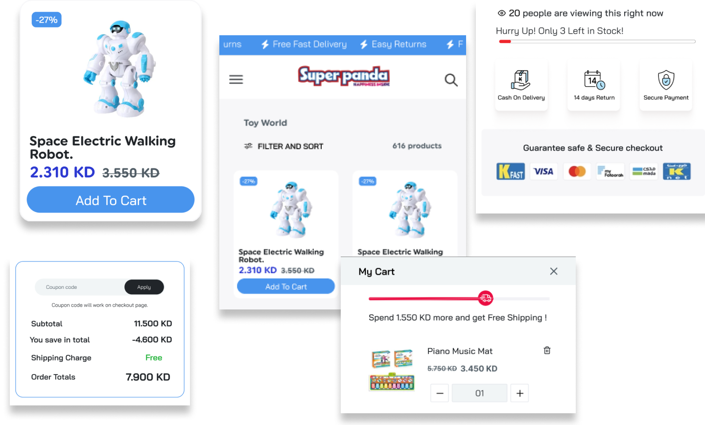
02 / Superpanda
Making product discovery easier.
Challenge: Unclear category flows made product discovery difficult for shoppers.
Approach: Reworked navigation, added quick filters and introduced a persistent cart preview.
Principle / Reduce the distance between intent and product.
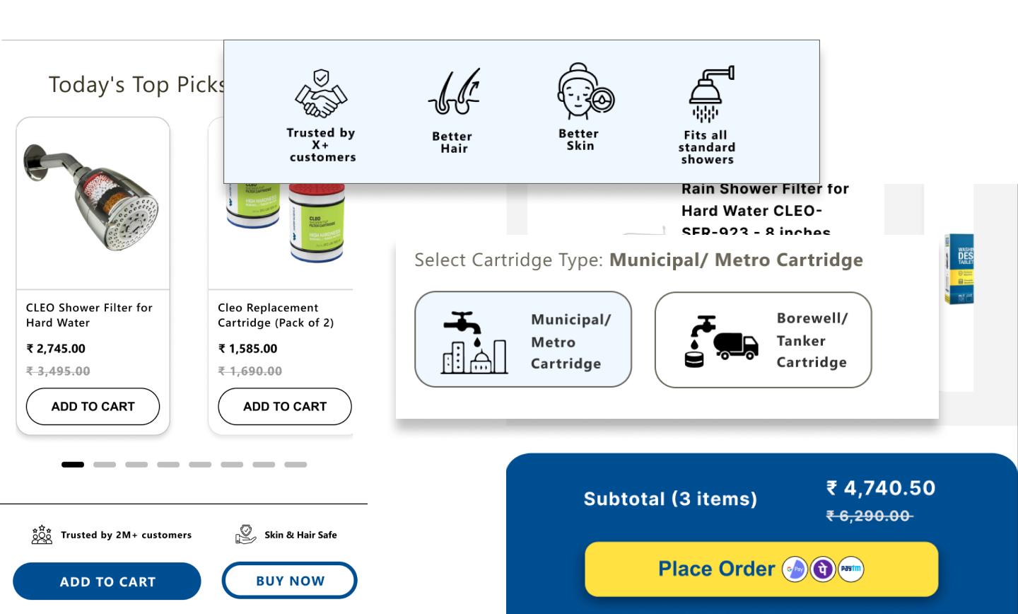
03 / WaterScience
Building confidence around high-value purchases.
Challenge: High-value items lacked enough credibility and information to support confident decisions.
Approach: Integrated trust signals, clearer delivery and warranty information, and comparison helpers.
Principle / When uncertainty is the friction, information becomes part of the interface.
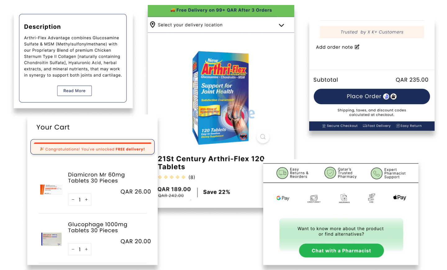
04 / Care n Cure Qatar
Removing friction at checkout.
Challenge: Lengthy checkout forms and unclear costs created unnecessary hesitation.
Approach: Streamlined checkout into two steps, clarified shipping and tax information, and enabled guest checkout.
Principle / The closer someone gets to buying, the less you should ask of them.
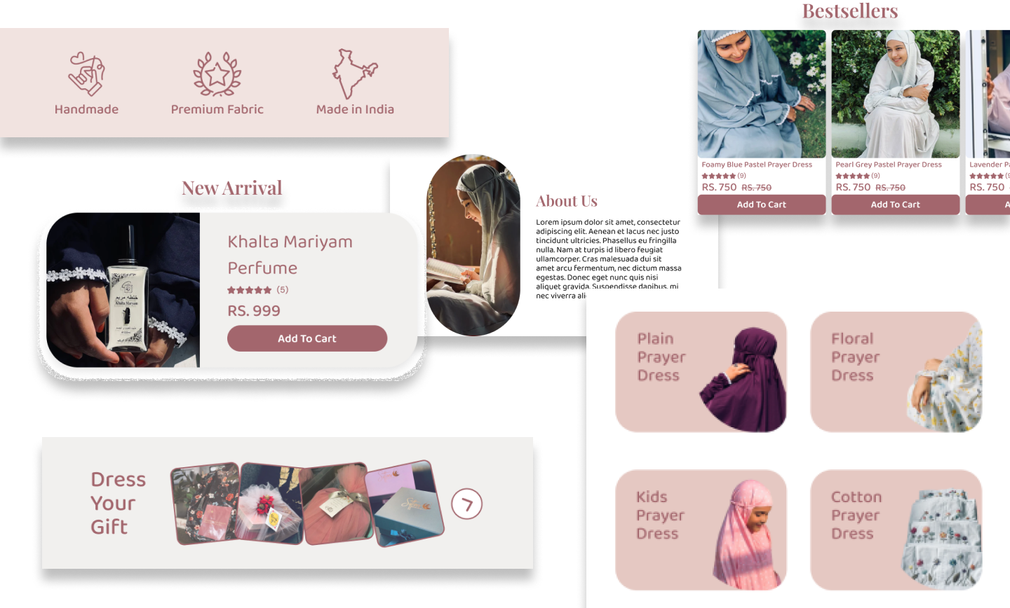
05 / Sitteer
Making the value proposition impossible to miss.
Challenge: The homepage did not communicate the brand's value clearly enough.
Approach: Redesigned hero messaging, added social proof and created focused landing flows with concise CTAs.
Principle / Clarity comes before persuasion.
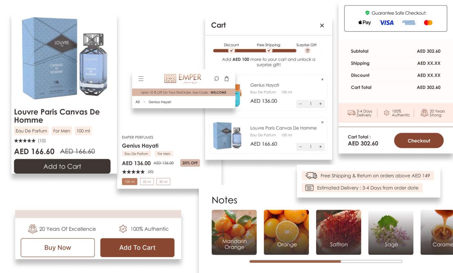
06 / Emper Perfumes
Designing a better mobile product experience.
Challenge: The mobile experience suffered from unoptimized visuals and difficult-to-scan descriptions.
Approach: Refined image presentation and copy hierarchy, then added scent notes and usage information.
Principle / Mobile isn't a smaller desktop.
04 / Design + data
The important part isn't the tool list. It is the loop.
Google Analytics / GA4, Hotjar, Optimizely / VWO, Figma and Jira supported the work. The underlying loop stayed consistent: Observe / Hypothesize / Design / Test / Learn.
01GA4
Funnel behaviour and analytics.
02Hotjar
Session recordings and behaviour.
03Optimizely / VWO
A/B experimentation.
04Figma
Wireframes and high-fidelity UI.
05Jira
Product and team workflow.
05 / What I learned
Design becomes more useful when you understand the uncertainty behind a decision.
01
Diagnose first.
A beautiful redesign can still solve the wrong problem if the friction hasn't been understood.
02
Every screen has a job.
Especially in e-commerce, each section should help users understand, evaluate or act.
03
Trust is an interface problem.
Shipping, warranties, reviews and product details are part of the experience, not secondary content.
04
Good CRO reduces friction.
The goal is to remove unnecessary barriers between intent and action, not to trick people into buying.
User behaviour / Design decision / Business outcome.
Worked across 6+ e-commerce platforms. Some client performance data is omitted due to access and confidentiality constraints.