Transforming e-commerce platforms into higher-converting experiences. Focused on user-centered, persuasive, and data-backed redesigns across product pages, checkout, and entire funnels.
At Conversion AB, I led e-commerce redesigns with a clear mission: boost conversions through rapid experiments, heuristic improvements, and research-backed design. Projects ranged from quick wins to full-funnel transformations supported by A/B testing and analytics.
My Role & Responsibilities
Conducted UX & CRO audits for e-commerce websites
Identified pain points & funnel drop-offs using analytics
Redesigned homepages, product pages, checkout flows, and navigation
Worked with dev & analytics teams to validate solutions via A/B tests
Tools & Methods
Google Analytics / GA4, Hotjar, Optimizely / VWO, Figma, Jira, and lightweight user testing.
The CRO Design Process
1
Audit & Insights
Usability reviews, funnel analytics, and session recordings revealed friction points and opportunities.
2
Hypothesis Building
Defined measurable hypotheses, success metrics, and instrumentation to validate design changes.
3
Redesign
Created wireframes and high-fidelity UI in Figma, focusing on clarity, hierarchy, and persuasion.
4
Test & Iterate
Ran A/B experiments, analyzed results, and scaled winning solutions via phased rollouts.
Client Redesigns
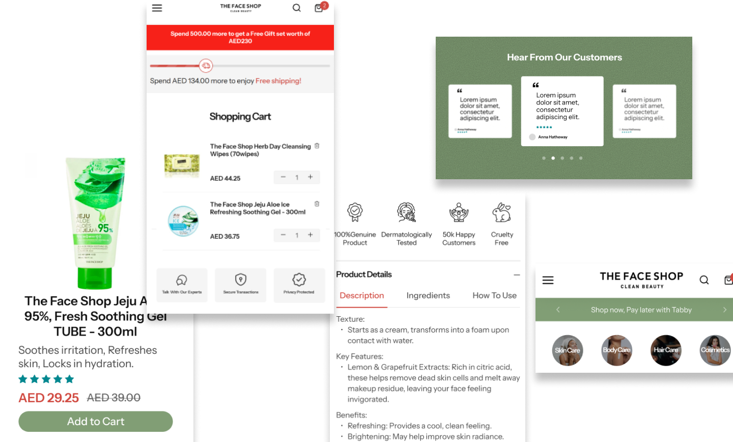
The Face Shop UAE
Challenge
Product detail pages were cluttered, leading to low add-to-cart rates.
Approach
Redesigned product hierarchy, simplified mobile-first layouts, and introduced high-contrast CTAs — reducing cognitive load and encouraging quicker purchase decisions.
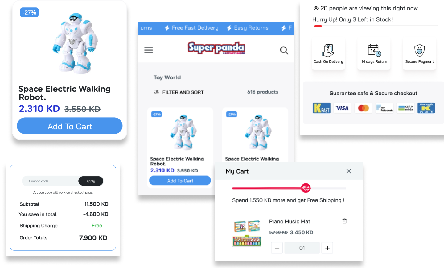
Superpanda
Challenge
Unclear category flows made product discovery difficult for shoppers.
Approach
Reworked navigation, added quick filters, and introduced a persistent cart preview — improving product findability and cart retention.
Integrated trust badges, detailed delivery & warranty info, and comparison helpers — boosting trust and improving conversion rates.
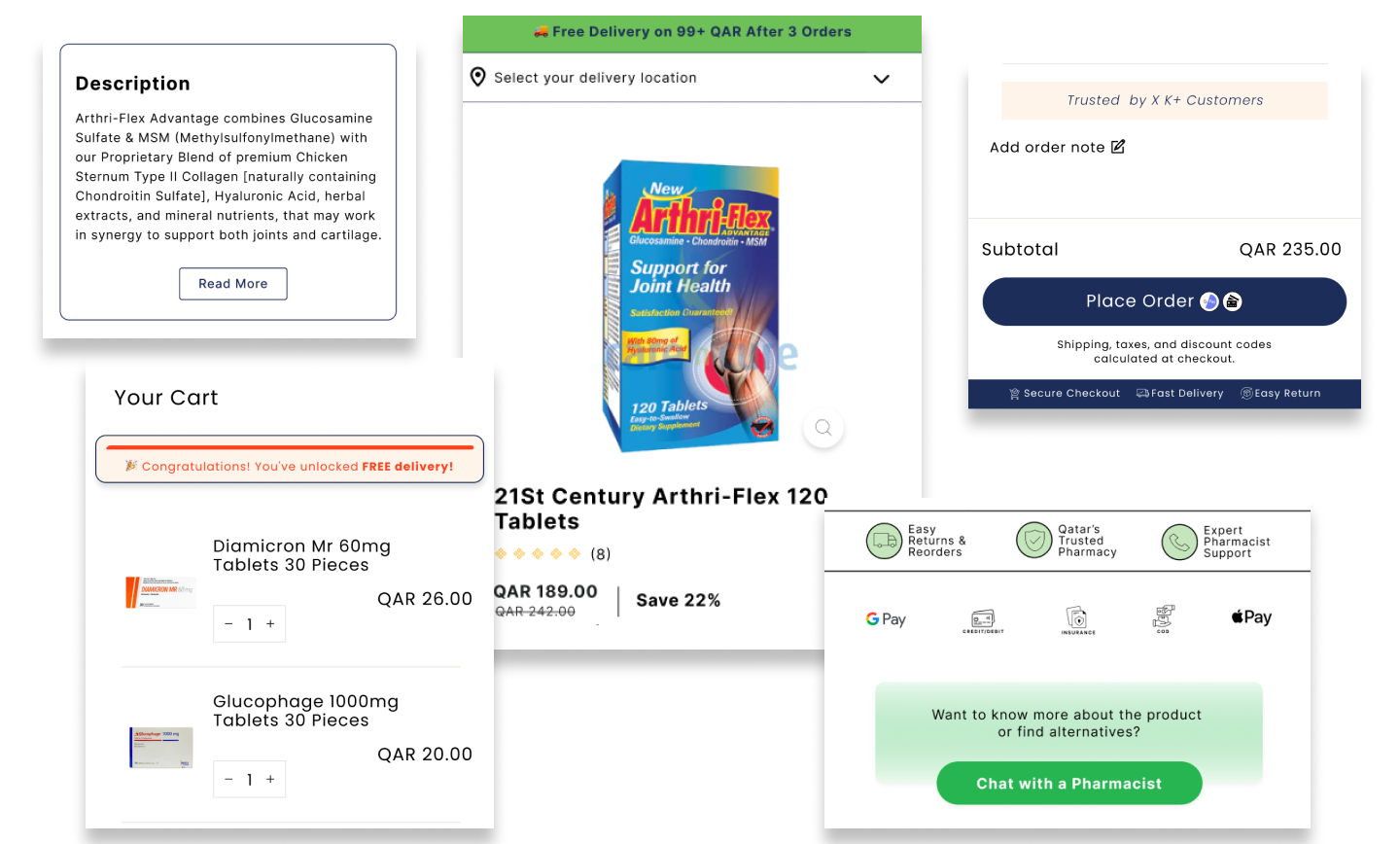
Care n Cure Qatar
Challenge
Lengthy checkout forms and unclear costs led to high abandonment.
Approach
Streamlined checkout into a 2-step process, clarified shipping/tax breakdowns, and enabled guest checkout — cutting friction at the final step.
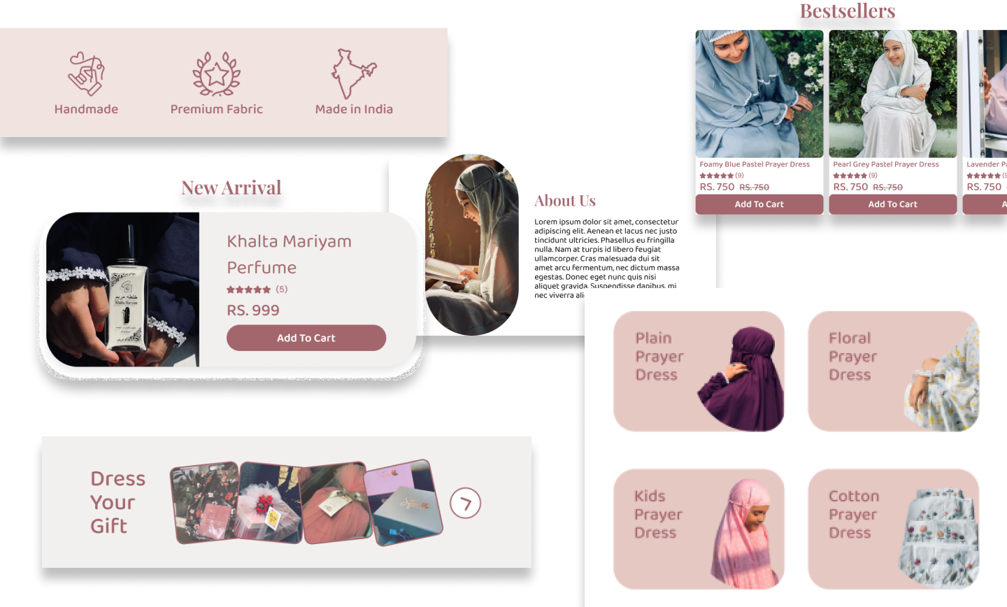
Sitteer
Challenge
Homepage failed to clearly communicate the brand’s value proposition.
Approach
Redesigned hero messaging, added social proof modules, and created focused landing flows with concise CTAs — making value communication sharper and conversion-focused.
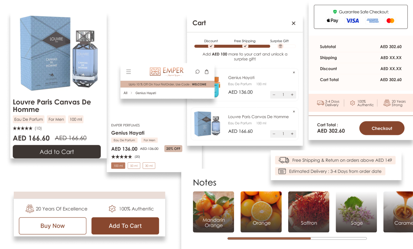
Emper Perfumes
Challenge
Mobile experience was weak due to unoptimized visuals and descriptions.
Approach
Enhanced mobile product pages with faster image loading, refined copy hierarchy, and added scent notes/usage tips — improving engagement and purchase intent.
Key Takeaways
Delivered CRO improvements across 6+ e-commerce platforms.
Improved usability, trust, and engagement through focused design changes.
Validated impact with measurable A/B testing and analytics insights.
Reflection
This work strengthened my ability to connect design with measurable business outcomes — showing how thoughtful design can directly influence revenue and customer satisfaction.